
Visit CHRIARA Studio
Our primary design studio is situated in the heart of Manchester, operating as a dedicated space for client consultations and collaborative workshops. We maintain strict project hours to ensure focused delivery.
Start a Conversation
Submit your inquiry below. We review all submissions internally and typically respond within two business days.
CHRIARA Field Guide
The Core Concept
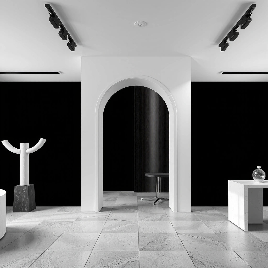
CHRIARA operates on the principle of "Radical Clarity." In a landscape saturated with noise, our methodology strips away decorative elements to reveal the essential function of your digital presence.
Decision Criteria
- 01 Functional Hierarchy: Does the layout guide the eye naturally from intent to action without distraction?
- 02 Load Velocity: Are all assets optimized for immediate rendering, respecting user bandwidth?
- 03 Semantic Integrity: Does the code structure accurately reflect the visual information hierarchy?
- 04 Contrast Fidelity: Is every text element readable under all lighting conditions and user preferences?
Myth vs. Fact
MYTH
"Minimalism means less content."
FACT
Minimalism means more intentional content. We write more, not less—every word must earn its place.
Glossary & Common Mistakes
Key Terms
- Void Space: Active area that separates, not empty space.
- Ghost Weight: Visual mass from non-text elements.
- Flow Rate: How quickly information is processed.
Avoid These
- • Excessive border radius on containers
- • Low-contrast grays for primary text
- • Unnecessary hero animations
- • Card layouts without clear tap targets
Engagement Workflow
Define Constraints
Initial call to establish scope, technical requirements, and timeline. We identify critical success metrics and potential blockers early.
Select Approach
Present wireframes and architectural decisions. Validate assumptions against your business logic before writing production code.
Apply Method
Execute with modular component design. We build in increments, allowing for mid-cycle adjustments without technical debt.
Review & Iterate
Deploy to staging for stress testing. We analyze user flow data and performance metrics to finalize the build.
Concrete Example: Landing Page Architecture
For a typical service landing page, we follow this sequence: (1) Header anchor with value proposition, (2) Evidence section (metrics or case studies), (3) Process visualization (like the steps above), (4) Trust indicators, (5) Contact form. No section exceeds 120 words to maintain cognitive load balance.
Signals of Trust
Average Load Time
Measured across 50+ deployed assets using WebPageTest standard metrics. Fast enough for 98% of mobile connections.
Semantic Compliance
Every project passes W3C validation and axe-core accessibility checks. No workarounds, no deprecated tags.
Support Response
Post-launch support includes direct communication channels for critical fixes during business hours.
Example Feedback Scenarios
"The reduced component set cut our maintenance time by 40%. We finally understand our own codebase."
— CTO, Logistics Platform
"Mobile conversions increased after the layout simplification. Fewer distractions meant clearer paths to purchase."
— Product Manager, E-commerce